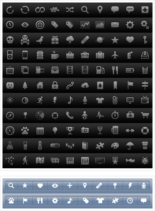
A great set of iPhone icons from Glyphish. (via benjaminf)
photo
photo
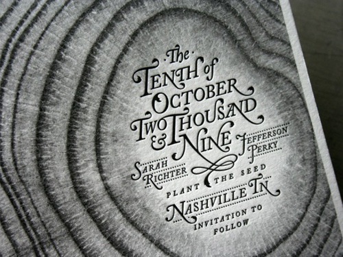
Another nice example of typography and letterpress.
photo
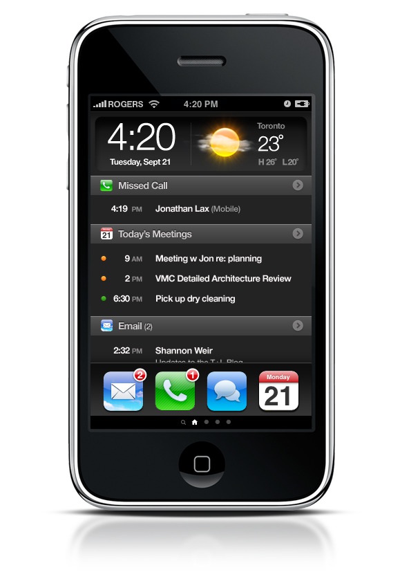
iPhone Home Screen Concept by Geoff Teehan
It’s an interesting concept and potentially very useful. However it feels like it’s becoming less like an iPhone and more like every other Smartphone.
photo
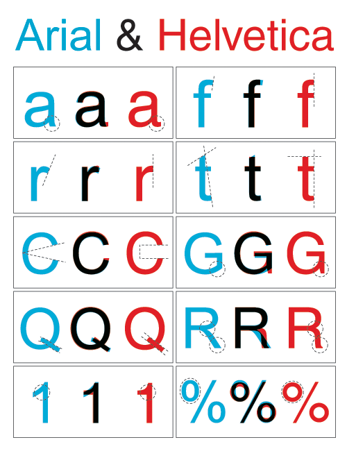
arial & helvetica
on friday, i hosted a screening of helvetica for some buddies of mine that didn’t know that there were other typefaces besides times new roman. it turns out, there ARE other typefaces and one of them is helvetica (and another of them is papyrus.)
the documentary does not explore the relationship between helvetica and microsoft’s derivative, arial. so to help ignite the post-viewing dialogue, i made this supplement illustrating the key differences in letterforms. however, in place of any spirited debate, my buddies decided instead to take turns delivering roundhouses to my jaw, saying “a documentary about a font is as interesting as it sounds.” i could not agree more.
photo
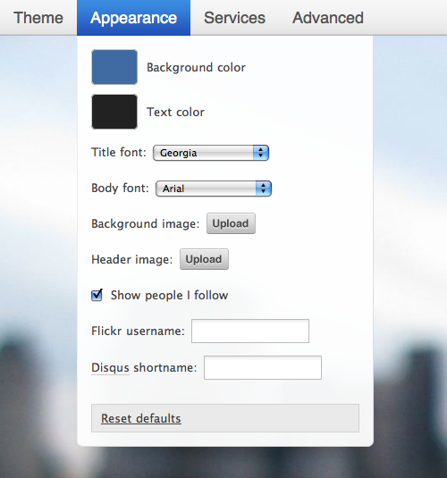
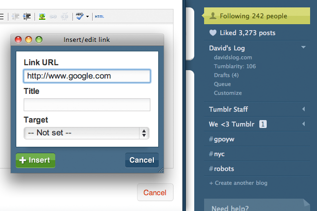
The Tumblr staff just posted a huge upgrade to theming, with options for Custom Fonts, Booleans, Text, and Images!
photo
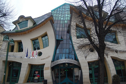
Krzywy Dom (real building)
I am not sure if i’d like to live/work in a building that makes you feel like your tripping out all the time.
photo
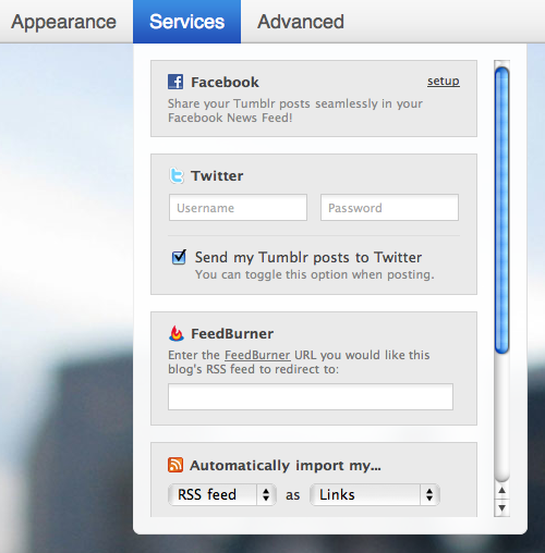
Now testing support for multiple Twitter accounts across multiple blogs! Please let us know if you see anything acting funny.
This is fantastic!
photo
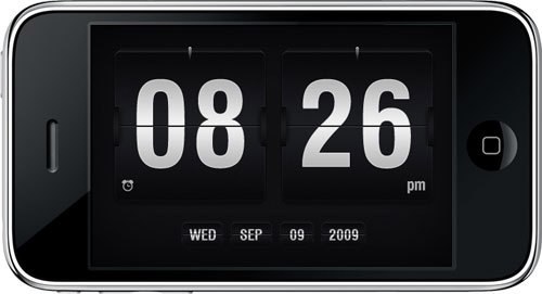
Embraceware Software, the company the brought you Awaken has released MobileAwaken for the iPhone. The UI is really impressive in particular when the app is in Fullscreen Clock mode.
photo
FROM H&FJ: A few years ago, we started wondering if there was a way to make a flat-sided sans serif that was disarming instead of brutish, one that employed confidence and subtlety instead of just raw testosterone. It was an unusual design brief for ourselves, completely without visual cues and trading in cultural associations instead: “more Steve McQueen than Steven Seagal,” reads one note; “whiskey highball, not a martini” suggests another.
The result is Tungsten®, a tight family of high-impact fonts in four weights: muscular and persuasive, without sacrificing wit, versatility, or style. Now starting at $99.
photo
Under Construction
We’re pushing a whole bunch of interface tweaks over the next couple weeks. Don’t be frightened! Some buttons and links might be out of place before everything is done.
Please let us know if you see anything acting funny.
So far the new UI looks nice. Good work.
photo
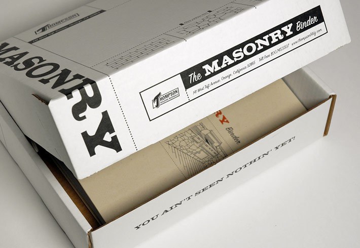
Decent design and typography is hard to find. This box represents a refreshing approach to the boring white box.
Page 11 of 29