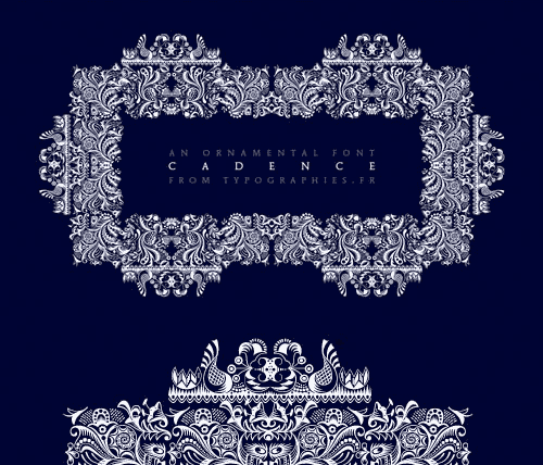
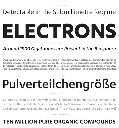
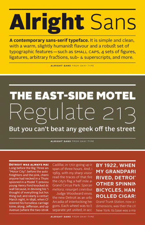
Alright Sans is a contemporary grotesk typeface. Simple and clean, with a warm, slightly humanist flavour, Alright Sans is fresh take on the traditional sans-serif. With a robust set of typographic features and 16 styles, Alright is ready to be used for just about anything.
photo
photo
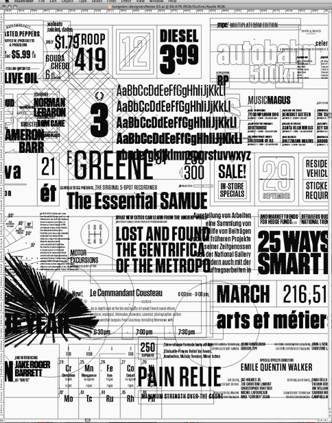
An excellent new blog post by Hoefler & Frere-Jones titled: New Fonts: A Graphic Designer’s Perspective.
photo

Now testing: Upload photos in Text posts
Take it for a spin! Let us know if you catch anything acting funny.
Wow. This is perfect. No more posting a “Photo” when you really want to post some “Text”.
photo
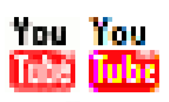
Typophile user, Miha, has created a fantastic case study for subpixel rendering. While the sample on the right looks discolored and messy blown up at this size, it actually looks better scaled down — far better than the current Youtube favicon. (via @matthewbuchanan)
The resultsspeak for themselves. The sub-pixel rendering looks fantastically better.
photo
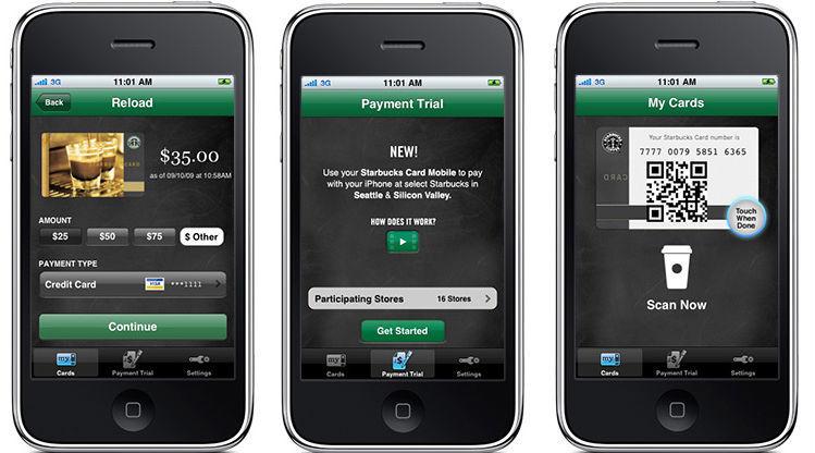
Starbucks Card Mobile gives users a virtual Starbucks Card and in 16 select stores in Silicon Valley and Seattle, users will be able to use this app to pay for their drinks. The app will display a barcode that the baristas at these stores will be able to scan. (via Now There’s Even an App That Lets You Pay for Coffee at Starbucks and dvint1)
Page 10 of 29

