arial & helvetica
on friday, i hosted a screening of helvetica for some buddies of mine that didn’t know that there were other typefaces besides times new roman. it turns out, there ARE other typefaces and one of them is helvetica (and another of them is papyrus.)
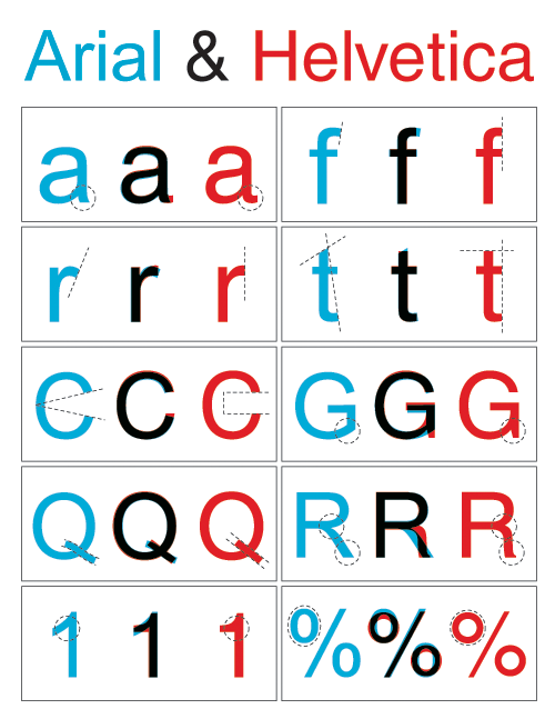
the documentary does not explore the relationship between helvetica and microsoft’s derivative, arial. so to help ignite the post-viewing dialogue, i made this supplement illustrating the key differences in letterforms. however, in place of any spirited debate, my buddies decided instead to take turns delivering roundhouses to my jaw, saying “a documentary about a font is as interesting as it sounds.” i could not agree more.
photo