Breyers Ice Cream brand redesign
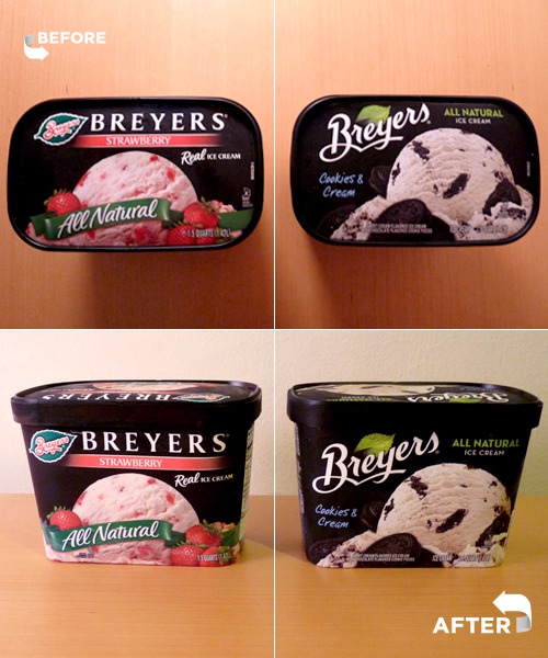
It was an unexpected surprise to discover a newly refreshed brand identity and ice cream packaging design for Breyers in the freezer aisle of the supermarket last week. Founded in 1866 by William Breyer in Philadelphia, the Breyers brand has gone through many iterations of the actual ice cream carton design over the years. The 1980’s marked the first large turning point for Breyers’ identity on the shelf.
As for the original Breyers logo design, we couldn’t find much information. A couple of sources credit the founder’s son, Henry Breyer, as the designer of the orignal logo and the one who conceptualized the idea of incorporating a briar leaf (an intentional pun on the family name). This is an interesting tid-bit seeing how we always thought it was a mint leaf.
The subtle modifications in the lettering style of the revised logo (right, lettering artist: Ian Brignell) may go unnoticed to the untrained eye.
Packaging redesign i understand but they also completely redid their classic logo. What ever happened to brand familiarity.