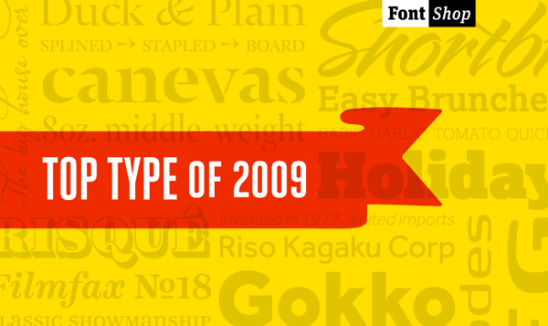
FontShop’s Top Type of 2009. My favourites among these are Geogrotesque, Heroic Condensed, Typonine Stencil and Mr Eaves.
Related Tags
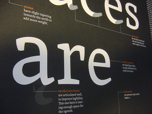
Instructional poster designed by David Březina for his Skolar typeface (served by Typekit as the body text face for this blog). Love that lowercase “a”. (via Johno Boardley)
Related Tags
jQSlickWrap
A clever jQuery plugin by Jason Feinstein that co-opts the <canvas> element to provide true text wrapping around irregularly-shaped images. (via CSS Beauty)
Related Tags
Available on Amazon.com for $37.79
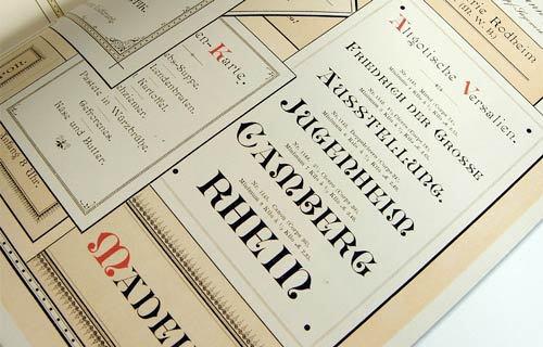
This book offers a novel overview of typeface design, exploring the most beautiful and remarkable examples of font catalogs from the history of publishing, with a special emphasis on the period from the mid-19th century to the mid-20th century, when color catalogs were at their height. Taken from a Dutch collection, this exuberant selection traverses the evolution of the printed letter in all its various incarnations via exquisitely designed catalogs displaying not only type specimens in roman, italic, bold, semi-bold, narrow, and broad, but also characters, borders, ornaments, initial letters and decorations as well as often spectacular examples of the use of the letters. The Victorian fonts, sumptuous and sometimes unbelievably outrageous, are accorded a prominent place in this book. In addition to lead letters, examples from lithography and letters by window-dressers, inscription carvers, and calligraphers are also displayed and described.
Related Tags

Fonts in Time and Space – Typographic video designed by Gretel. See the original video.
Related Tags
Related Tags
Mr Eaves is the often requested and finally finished sans-serif companion to Mrs Eaves, one of Emigre’s classic typeface designs. Created by Zuzana Licko, this latest addition to the Emigre Type Library expands the versatility of the original Mrs Eaves with two complimentary families: Mr Eaves Sans and Mr Eaves Modern.
Related Tags
Related Tags
Related Tags
Related Tags