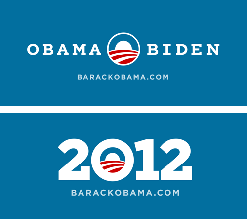
Gotham Serif for the 2012 Obama re-election campaign.
Related Tags
Related Tags
H&FJ is delighted to introduce Vitesse®, a new slab serif in twelve styles.
Slab serifs are one of typography’s most vibrant categories, yet they remain dominated by two ancient forms: the nineteenth century Antique, and the twentieth century Geometric. Both are vital and living genres — we’ve explored each of them, in our Sentinel and Archer type families — but what of the twenty-first century slab? Vitesse revels in the tension between organic letterforms and mechanical grids, and offers designers a distinctive new voice that’s suave, confident, and stylish. Engineered for responsive handling and a sporty ride, Vitesse is now available, starting at $199.
Related Tags
Fonts in Time and Space – Typographic video designed by Gretel. See the original video.
Related Tags
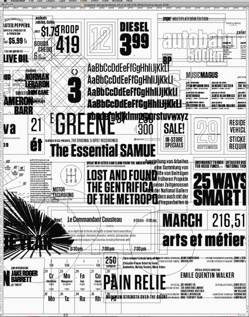
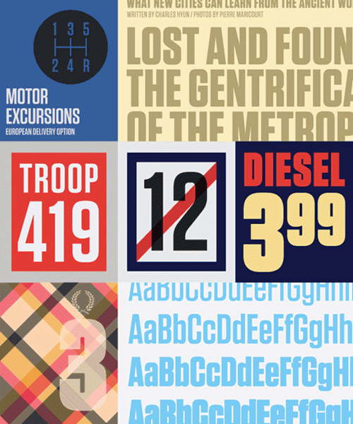
An excellent new blog post by Hoefler & Frere-Jones titled: New Fonts: A Graphic Designer’s Perspective.
Related Tags
FROM H&FJ: A few years ago, we started wondering if there was a way to make a flat-sided sans serif that was disarming instead of brutish, one that employed confidence and subtlety instead of just raw testosterone. It was an unusual design brief for ourselves, completely without visual cues and trading in cultural associations instead: “more Steve McQueen than Steven Seagal,” reads one note; “whiskey highball, not a martini” suggests another.
The result is Tungsten®, a tight family of high-impact fonts in four weights: muscular and persuasive, without sacrificing wit, versatility, or style. Now starting at $99.
Related Tags
H&FJ Suggests: Fonts for Annual Reports
A great little promotional article from H&FJ about typography in annual reports, financial disclosures, and investor presentations.
Related Tags
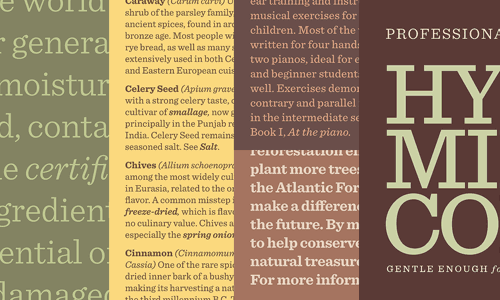
Sentinel: the slab serif that works. For everyone who wishes Clarendons had italics, and everyone whose favorite slab serif is shy a few weights: Sentinel was designed for you.
Related Tags
Related Tags